Polling
Explain uncertainty
Showing uncertainty helps audiences better understand the process behind the numbers. Through our audience research, we have learned a great deal about how news users understand statistical uncertainty. Not being clear about how a poll was developed can produce serious misunderstandings. For example, many people interpret “margin of error” to mean that mistakes were made in the process of collecting responses.
Here are some things you can do to explain uncertainty:
1) Explain what "margin of error" means the first time you introduce it in an article. Don’t just provide a value for margin of error without context.
DO THIS
Feel free to link to our explainer, or to borrow our language: “This poll has a 3% margin of error, which means that if x% of the respondents said something, the number of all Americans who would agree is probably between (x-3)% and (x+3)%. That margin gets bigger if we look at subgroups among the people polled.”
DON'T DO THIS
"The margin of error for the overall sample is approximately 3%" (a common phrase at the very bottom of a page or end of a segment, in a methodological note, with no further explanation).
DISCUSSION
Our research has found that people assume “error” refers to something deliberate, rather than an inherent limitation of the method. To avoid conveying this mistaken assumption, explain what the phrase means to readers, and if possible, represent it graphically so that audiences can visualize its significance for a given poll result. Another option would be to talk about “confidence intervals” instead of “margins of error.” While not widely used in journalistic writing, this is more easily understood in real world settings as “something we’re not sure about.”
This piece on homelessness is an example of a report that talks about data in a very clear way. Two of our favorite lines: "Because they didn’t have information from every person in the county, there was some uncertainty in the data." and "This confidence interval represents their estimate, an exact number that falls between the ‘highest estimate’ and ‘lowest estimate.’"
2) Specify the margin of error for different subgroups, and give context for this number
DO THIS
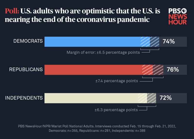
A graph (see below) measuring the opinions of Democrats, Republicans, and Independents highlights margin of error values for each of these groups.
DON'T DO THIS
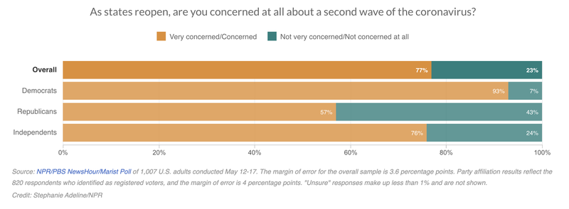
A graph (see below) asking Democrats, Republicans, and Independents their opinion on COVID-19 reopenings provides only the overall margin of error, not that for each group.
DISCUSSION
Most people are not aware that margin of error is inversely related to sample size. That is, margin of error increases as sample size decreases. And that means that a subgroup sample will always have a larger margin of error than the full survey sample, because the group is smaller by definition.
3) Embrace uncertainty. And be sure to account for margin of error in headlines.
DO THIS
One headline correctly identified a pre-election poll as inconclusive: "Georgia Senate Race: Polls Show Walker And Warnock In A Near Dead-Heat Two Weeks Before Runoff."
DON'T DO THIS
Another pre-election headline reads, "Warnock holds a narrow edge over Walker in final undecided Senate contest," although the polls were not statistically conclusive at that time.
DISCUSSION
The second headline above was generated on the basis of a poll showing that 52% of likely voters supported Warnock, compared to 48% for Walker. But the margin of error for that poll was 3.8 points, casting into doubt the claim that Warnock held a “narrow edge.” When results are this close, language like “narrow edge” can be misleading. Instead, it is better to use words that more accurately convey this, as the first example does with the expression “near dead-heat.” As most polls have a margin of error of at least a few percentage points, 52% will rarely indicate a true majority. It’s misleading to describe it as one. Keep in mind that using exact figures can sometimes confuse rather than clarify.
4) Whenever possible, visualize uncertainty. Don’t assume that textual references to things like “margin of error” will be sufficient.
DO THIS
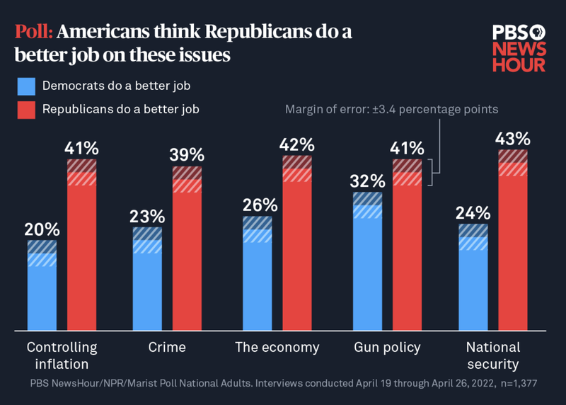
There are lots of ways to use shading in graphics to indicate that we know a range but not an exact value. The figures in this article do it well:
This article offers another good way to visualize margin of error data:
DON'T DO THIS
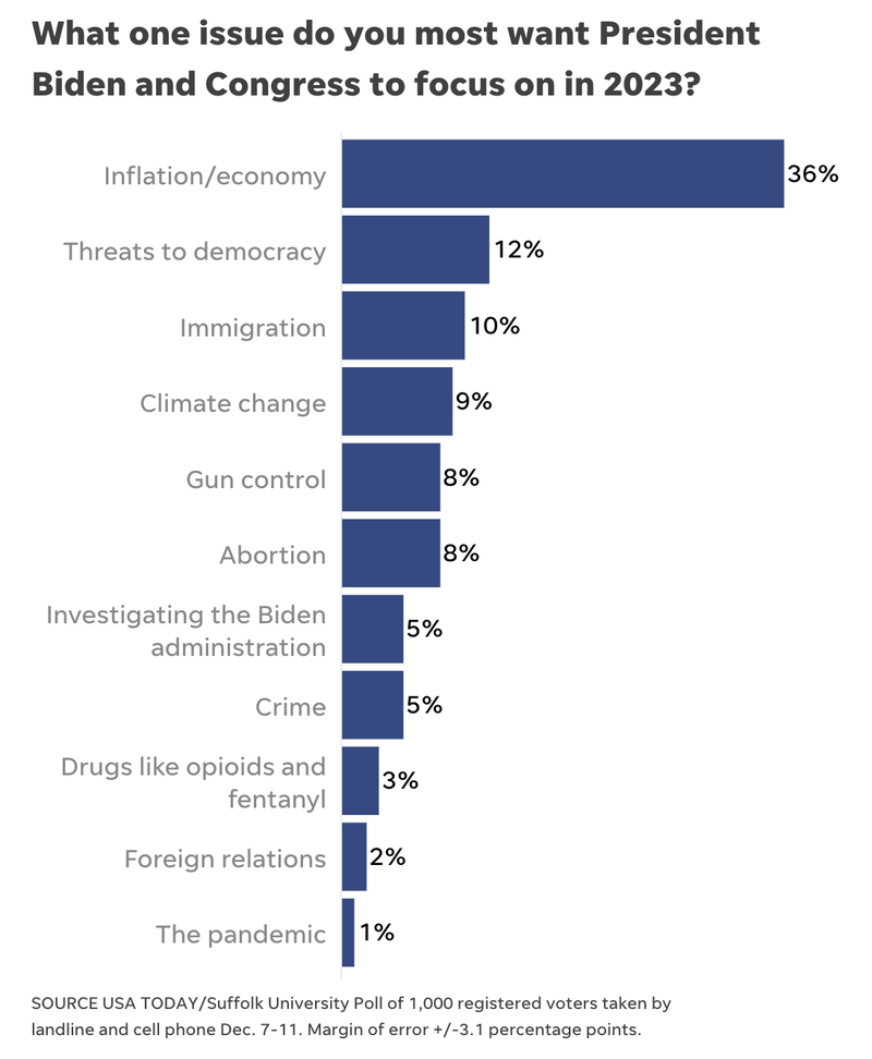
An article reporting on a poll that asked respondents to list the “one issue” they wanted President Biden and Congress to focus on in 2023 includes a graph (see below) of survey results, but does not visually represent margin of error data.
DISCUSSION
The first example above uses shading to visualize information about the poll’s margin of error. The shading helps a viewer understand the inherent limitations of polling. It’s particularly helpful to show that opinions may be closer than they initially appear. For example, the figure above shows that opinions of Democrats’ and Republicans’ gun policy may actually be more similar than the point estimates would suggest. By contrast, the third graph includes no information about margin of error. Elsewhere in the article, readers learn that the poll had a margin of error of “plus or minus 3.1 percentage points,” but it is unclear how this affected the overall results. To help audiences interpret this data, use shading or other text to visualize margin of error data for each response.
- Previous
- Explain the methods