Health and Medicine
Guidelines for using graphs and other forms of data visualization
1) Keep things simple. Don’t overload visual displays with multiple forms of data.
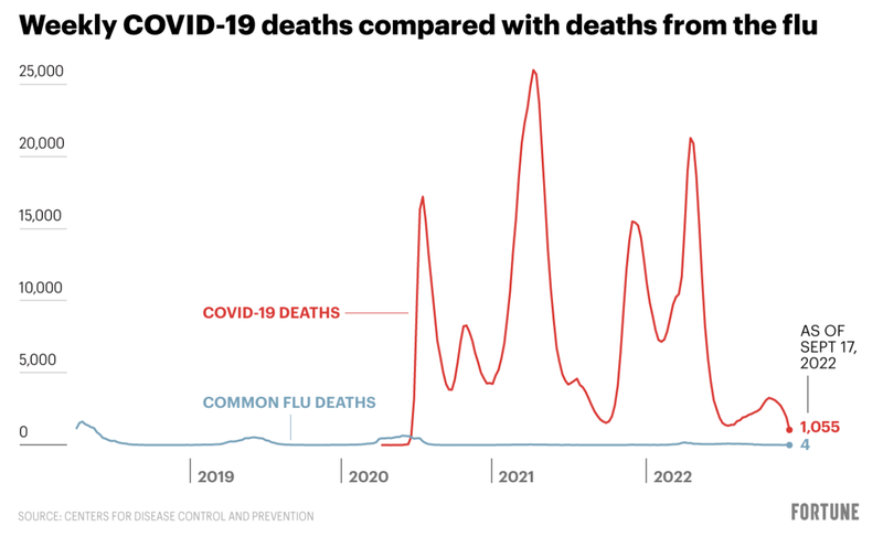
DO THIS
A graph (see below) comparing deaths from influenza and COVID-19 has minimal text, and includes only two sets of data.
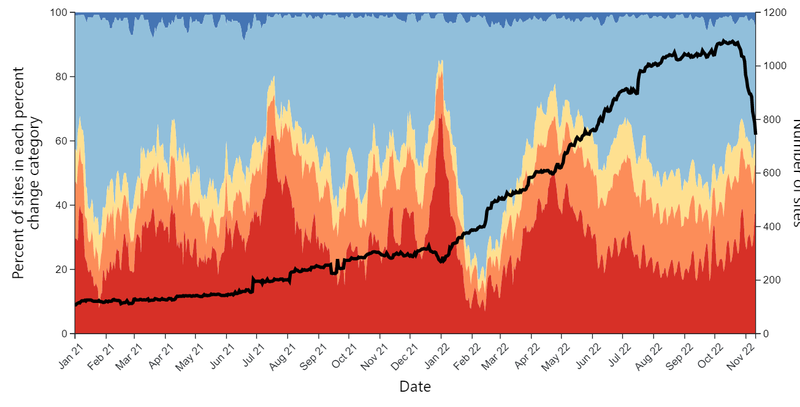
DON’T DO THIS
A graph (see below) illustrating data on COVID-19 wastewater positivity rates tries to present two trends simultaneously: the change in positivity rates (percent of sites in each percent change category) as well as the number of sites.
DISCUSSION
Whenever presenting medical or public health data in graphical form, it’s important to keep things as simple as possible. The second example uses dual axes to plot multiple types of data, and would be incomprehensible to most readers. Never try to force too much information into a single graph; when there are more than two things to track, the best practice is to separate things out into multiple graphs.
2) Draw attention to the main point or key finding within the data you’re visualizing.
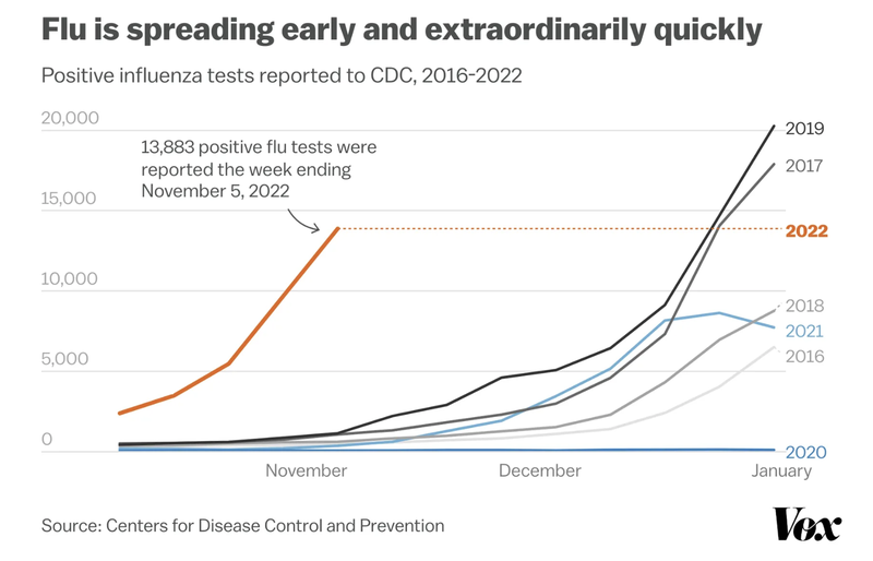
DO THIS
A graph (see below) displaying influenza trends from 2016 through 2022 uses textual cues to guide readers toward the most important data points.
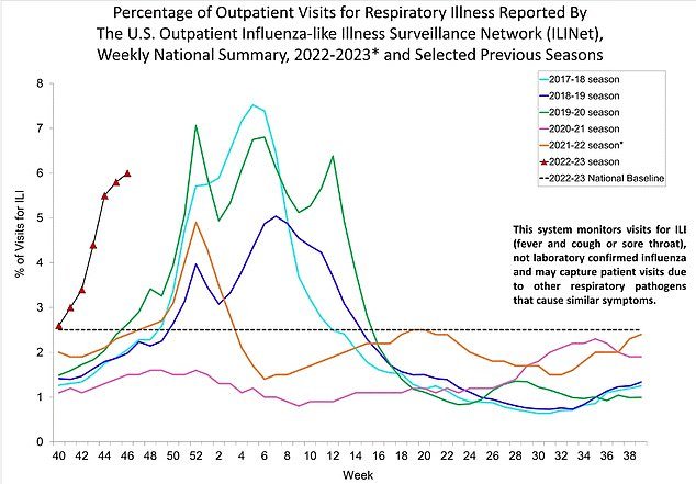
DON’T DO THIS
A graph (see below) displaying influenza trends from 2016 through 2022 includes some text alerting readers to the key takeaway in the data (“levels are higher this year than at any other since 2010”), but this is located in the caption, and the other text has nothing to do with the graph’s main point.
DISCUSSION
Data visuals do not need to be entirely free of words. Skillfully placed text, such as that seen in the first example, works to separate background contextual trends from the most important data point in the visual, as does the graph’s title (“Flu is spreading early and extraordinarily quickly”). By contrast, though the second example displays the same data, the key takeaway point only becomes clear after reading the caption (something not everyone will do).
3) When using graphics on video, use numbers on screen to highlight important points
DO THIS
4) When using graphics in video, make sure the data on screen echos the script
DO THIS
DISCUSSION:
On video, numbers fly by and you cannot count on the viewer to go back to watch what they missed. So spread out numbers throughout the piece as much as possible or else clearly reflect them in graphics. Graphics can also be dynamic, moving in real time on the screen to reflect the change or trends they’re trying to portray.
- Previous
- Guidelines for reporting on risk