Economics
Using graphs and other forms of data visualization
1) When using graphs, make sure these have titles, and that all axes are clearly labeled.
DO THIS
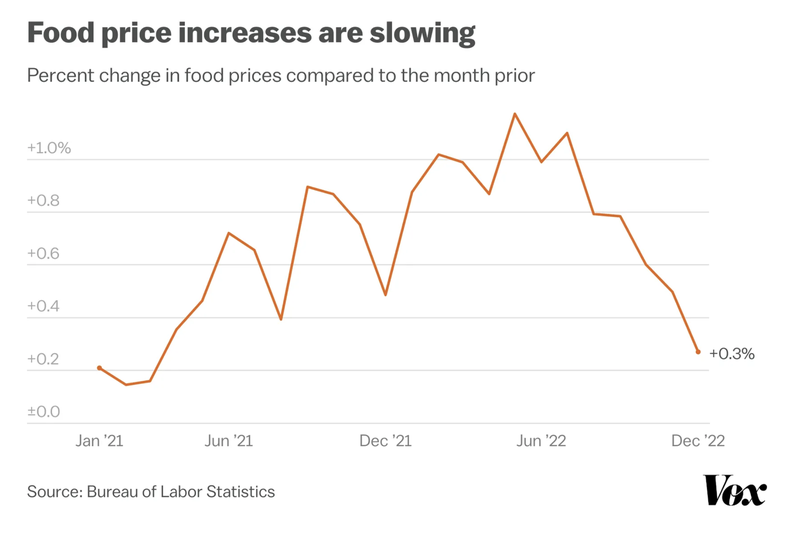
A graph (see below) displaying information on changing food prices between 2021 and 2022 breaks this up into six-month segments, with separate markers along the X axis for January 2021, June 2021, December 2021, June 2022, and December 2022.
DON’T DO THIS
A graph (see below) placed in an article about rising food prices lacks a title as well as what data points mean.
DISCUSSION
Data visuals need to be accompanied by text. Titles are especially important, as they cue people into the kinds of data being presented. Titles can also be used to contextualize this data, and to draw attention to the key takeaway points within a given graph or chart. The first example does this quite effectively, as the title “Food price increases are slowing” directs readers’ eyes to the major trend in the data. By contrast, the graph in the second example does not even include a title, which means that readers are left for themselves to try to determine what is being tracked and what all of these individual data points mean. To avoid this kind of confusion, add titles, and make sure all axes are clearly labeled.
2) Make sure that captions, legends, and footnotes are all clear, comprehensible, and appropriately located.
DO THIS
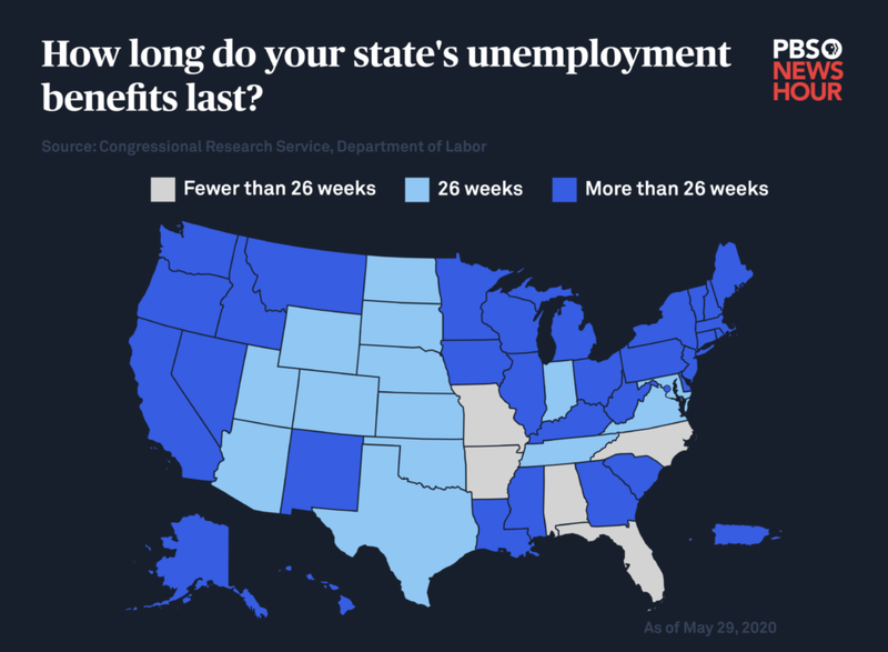
A map (see below) displaying data on unemployment benefits around the U.S. includes a key that clearly explains the colors used to illustrate differences between states.
DON’T DO THIS
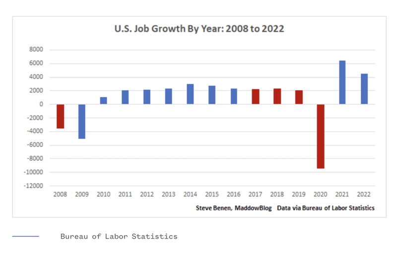
A chart (see below) depicting U.S. job growth since the “Great Recession” of 2008 fails to explain what the difference between red- and blue-shaded bars is, and lacks anything resembling a legend.
DISCUSSION
Data visuals need to be accompanied by text, including titles, captions, legends, and keys. Construct each of these elements in ways that help audiences understand the data you are depicting. The first example displays this information prominently and accessibly, while the second contains nothing to help readers understand the difference between blue- and red-shaded bars (which viewers might interpret politically, as in GOP = red and Democrats = blue). Without this key information, audiences will not be able to understand or interpret data visuals.
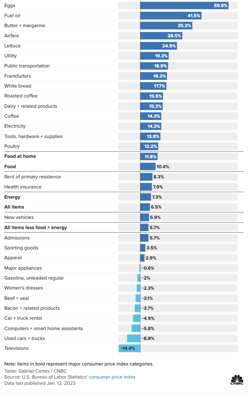
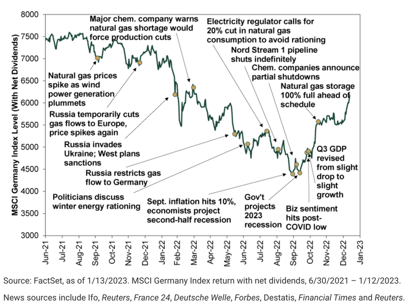
3) Keep things simple. Avoid overloading graphics with too much data.
DO THIS
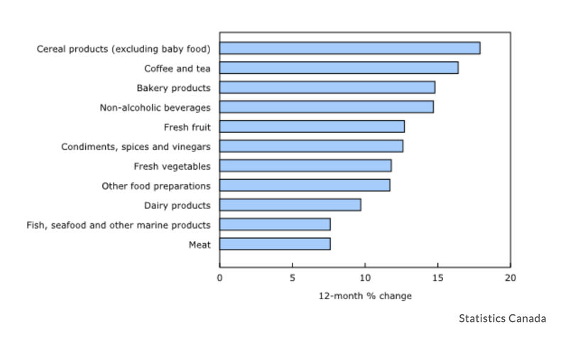
A chart (see below) lists changes in the cost of over two dozen goods and services over the course of 2022.
DON’T DO THIS
A graph (see below) displaying German stock market trends is jam-packed with text, arrows, and a series of unnecessary monthly chronological markers along the X axis.
DISCUSSION
Whenever presenting economic data in graphical form, simpler is generally better. Although the first example contains lots of data, devoting one line to each data point makes the visualization both comprehensive and comprehensible. By contrast, the second example attempts to package a dizzying amount of data into a single graph, and is rather unreadable. Moreover, the accompanying text does little to explain these data points.
- Next
- Additional resources