Polling
Explain other limitations and uncertainties of the method
Helping audiences understand what polls can tell us, and what they can't tell us, is one of the most important things you can do. In our audience research, we consistently hear that people want more information about the limitations of polling data.
Here are some things you can do to explain the limits of polling data:
1) Tell audiences when polls were fielded, and provide external context about those dates
DO THIS
A story written immediately after the February 2022 Russian invasion of Ukraine begins, “About half of the U.S. public — 52 percent — said this week that they support how Biden is handling the situation in Ukraine. Two weeks ago, as Russia was getting increasingly aggressive toward its neighbor and had yet to invade, that number was much lower.”
DON'T DO THIS
An article exploring Americans’ attitudes on immigration cites a poll showing that while 30% of adults believe that immigration has made the country worse off, 35% believe it has made the country better off. These figures are taken as evidence that the “immigration divide” has “sharpen[ed],” although no comparative polling data is provided to support such an assertion.
DISCUSSION
Polls offer snapshots of particular moments in time. To help audiences understand this, it’s important to always provide information about when a given poll was conducted. And as a single poll cannot be used to make inferences about changes over time, claims about trends always need to be grounded in evidence taken from multiple poll results. Providing context about what changed between two dates helps audiences understand the comparison. When we show audiences a comparison and they don’t understand why those dates were chosen, it dilutes overall understanding.
2) Remind audiences that polls can only offer a “snapshot” glimpse of a particular moment in time and point out trends when they are available
DO THIS
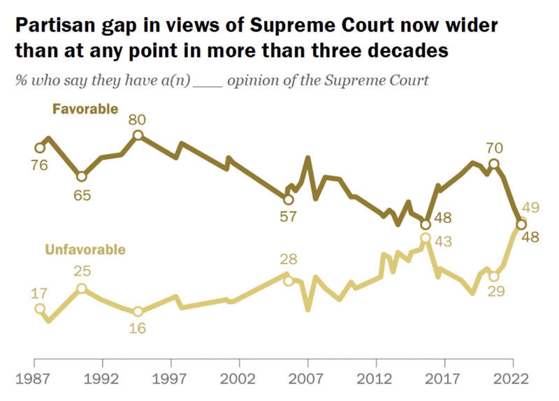
Show trends over longer periods of time, as in this figure:
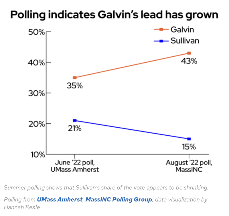
DON'T DO THIS
Showing just two points does not provide enough context for a trend:
DISCUSSION
When the same question is asked repeatedly over time, polls can offer information about longer term trends. Report on these! Don’t allow audiences to assume that a given poll reflects past realities, or that trends can predict the future. Two data points, as seen in the second example, aren't really a trend. It's much more helpful to audiences if they can compare the steepness of a change with previous fluctuations.
3) Tell audiences who exactly was polled, who responded, and about other matters pertaining to sampling strategy. Be clear about the implications of those choices
DO THIS
One headline about a summer 2022 survey reads, "26% of job switchers regret joining the Great Resignation, survey finds: ‘They’ve sobered up’"
DON'T DO THIS
Another headline on the same story reported, “Millions of Americans Regret the Great Resignation.”
DISCUSSION
Many polls can only tell you about the specific people who answered it, not about “all Americans.” Don’t allow audiences to assume that poll results can be generalized to the entire population. Generalizability requires a sample that is both random and representative of variation among the larger population. In this case, the survey was conducted with job seekers, who are probably more likely to be unhappy in their current situation than the average person, since they are actively trying to change it.
4) Tell audiences about the percentage of respondents who chose answers such as “don’t know” or “not sure” or “neither.”
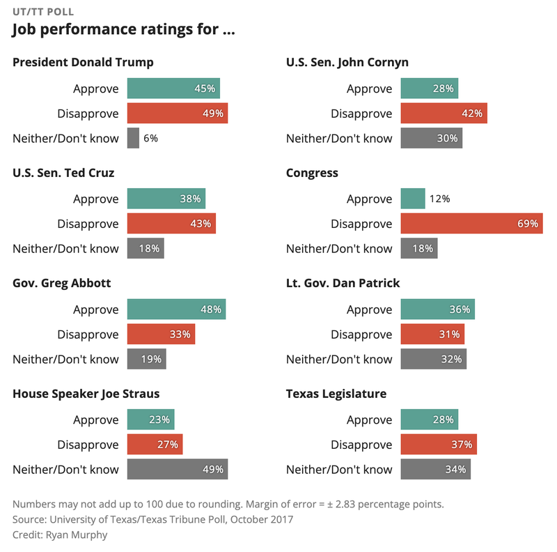
DO THIS
An article discussing a poll (see below) in which respondents were asked to provide job performance ratings for several American politicians shares data on the percentage who chose “approve,” “disapprove,” and “neither / don’t know.”
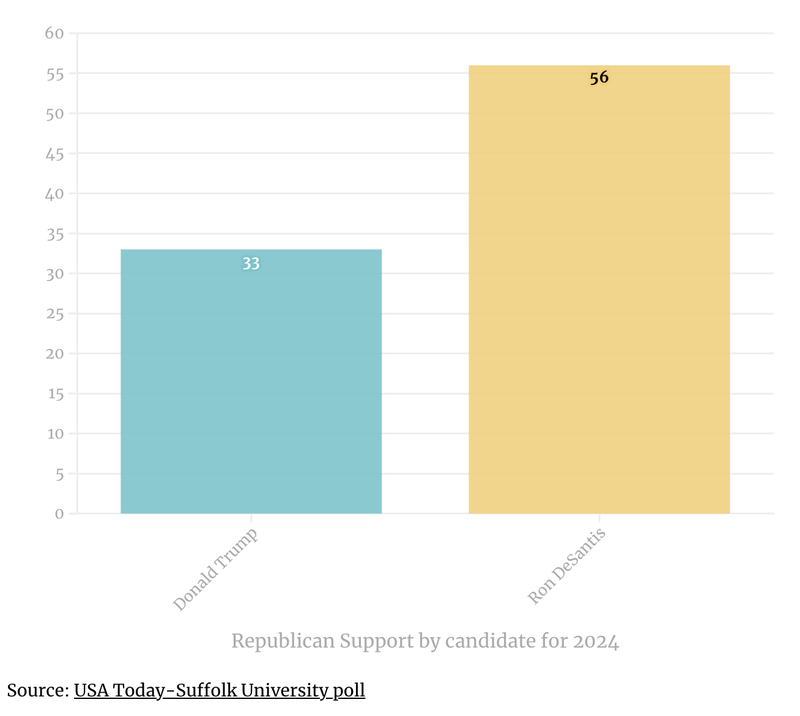
DON’T DO THIS
An article on Republican voters’ preferences for the 2024 presidential election cites a poll (see below) in which 56% of respondents indicated support for Ron DeSantis, compared to 33% for Donald Trump. The percentage of respondents who supported neither of these potential GOP nominees was not listed.
DISCUSSION
There are many other ways respondents can answer a question than simply “yes” and “no.”In many opinion polls, a significant number of respondents choose options such as “don’t know” or “neither” or “not sure.” Failing to report on these responses can lead to figures and descriptions in which 20 to 30% of people are unaccounted for. And when results do not add up to 100%, audiences can easily make unwarranted inferences based on the data (for example, the missing percentage refers to those who did not respond to the poll). This is why it’s important to always include responses to all survey responses when reporting on polls.
5) Tell audiences whenever the results of one poll conflict with others that asked similar questions and what might account for different results.
DO THIS
A report on support for Scottish independence noted how “two polls produced contrasting results,” and explores how divisions within the independence movement might be “affecting vote intention.”
DON’T DO THIS
A report on two different public opinion surveys notes how one of these reported a “51% disapproval rating for Biden, compared to Rasmussen’s 60%.” No reasons for the discrepancy are put forward.
DISCUSSION
Polls exploring similar things often produce different results, and there are many reasons why this might be the case. Time of survey is an important factor, as fast-changing events can have a significant impact on people’s attitudes and opinions. Differences in survey methodology are another factor to consider. Regardless, it is always helpful to share evidence from multiple surveys, and to explain what might account for differences in results. Doing this will help audiences understand the limitations of polling, and will prevent them from walking away with a sense that all polls are useless.
- Previous
- Explain uncertainty